Table of contents
Learning Business intelligence tools like power Bi is the most important task that you can do from multiple sources. But, building your first project on Power Bi is one of the toughest tasks when you just learned it with no practical experience. So, here is one of the guided projects for upcoming Data Analysts or Business Analysts to attach to your CV.
We are working on a Customer Churn Analysis Project, Churn Analysis is a process of using the company and customer data to understand to churning rate of customers (i.e, How many customers stop taking services from the company? Why customers start leaving? What are the factors affecting churning rate of customers? How can we reduce the churn rate?).
The dataset used for this project is of the telecom company and we need to figure out the churning customers and why it is happening. This dataset is taken from Kaggle and you can download this data from Kaggle by clicking here, you can only read the context and content about the telecom company dataset.
Data Cleaning and Data Exploration
While Exploring the dataset, you will be able to find that there are 11 missing values in the Totalcharges column. So, we need to remove these 11 rows.
Now, we need to confirm that all customerID should be unique to prevent any error in the results. For that, we need 2 new measures,i.e., no of total customers and no of total customers(=7032), and both of these measures need to be equal to make sure the customer is unique.
no of total customers = count('WA_Fn-UseC_-Telco-Customer-Churn'[customerID])
no of unique customer = DISTINCTCOUNT('WA_Fn-UseC_-Telco-Customer-Churn'[customerID])
The churn column is telling us if the customer churned or not by giving values like "yes" or "no". But we will not be able to use these values, so we will create new churned customers which will convert-
Yes into 1
No into 0
customer churned = IF('WA_Fn-UseC_-Telco-Customer-Churn'[Churn]="yes",1,0)
Churn Rate
While doing churn analysis, it is very important to find out the churn rate as it is a measure of the number of customers who leave the company in a given period of time.
Churn rate = Total number of customers lost during the period/Total Number of customers of the company at the beginning of the period * 100.
We have a number of total customers (calculated in the beginning), so we need to calculate the number of customers lost or churned customer.
No of customer churned = SUM('WA_Fn-UseC_-Telco-Customer-Churn'[customer churned])
Now we can calculate the churn rate using this information, after creating the churn rate measure, change its format in percentage in the data panel.
Churn Rate = 'WA_Fn-UseC_-Telco-Customer-Churn'[No of customer churned]/'WA_Fn-UseC_-Telco-Customer-Churn'[no of total customers]
Data Visualization and analyzing
Churn rate
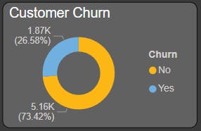
1869 customers churned or leave the company from a total of 7032 customers, hence churn rate of a company is pretty high as it is over 20% (26.58%)
Begin with creating the first visualization by putting three cards for no of total customers, No of customers churned, and churn rate, change the name of this measure for this visualization to Total Customer, No of customers churned, and churn rate.
Also make the donut card for customers churn, using the churn column in the legend and no of total customers in values.

Churned customer by gender
Churned rate is not depending on the gender demographics of customers, as both genders are equally leaving the company( 930 churn customers is male whereas 939 churned customer are female).
Use Clustered column chart to visualize customer churning by gender where put the gender column in the axis, churn in the label, no of total customer in the values option.

Churned customer by Seniority
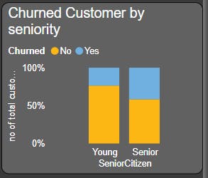
Senior citizens just doubled the churn rate. The churn rate for young citizens is 23.65% whereas the churn rate for senior citizens is 41.68%.
A 100% stacked column chart is used where put SeniorCitizen at the axis, churn at legend, no of total customers at Values.
Churning rate by contract type
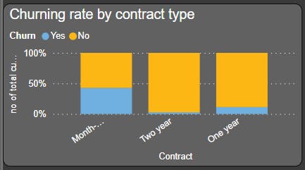
The churn rate is maximum in month-to-month contract type at 42.71% whereas minimum in two-year contract type with just 2.85%. That means customers are more likely to leave the company with a month-to-month contract and less likely to leave the company with a two-year contract type.
Used 100% stacked column chart to visualize churning rate by contract type, put the contract on the axis, churn on the legend, and no of total customers on the values.
Churning rate by tenure
From the graph, we can see that the customers who do not churn tend to stay with longer tenure with the telecom company.
Use clustered column chart to visualize this by taking churn on the axis bar and the average of tenure on the values bar.

Churning rate by payment method
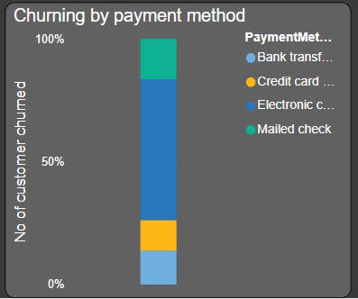
From the graph, it's clearly visible that the maximum no. of customers churned who use Electronic Check as their payment method with a churning rate of 57.3% whereas it is less likely for the customer to churn who use credit cards as their payment method with 12.41% of churned customer.
A 100% stacked column chart is used to visualize the churning rate by payment method, putting the payment method on the legend bar and no of churned customers on the values bar.
Churning rate by Monthly charge
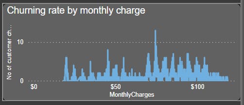
From the graph, it's clearly visible that the percentage of churned customers is more when the monthly charge is large.
Use a line chart to visualize the monthly charge of churned customers by taking the monthly charge on the axis and no of customers churned on the values bar.
Churning rate by Total charge
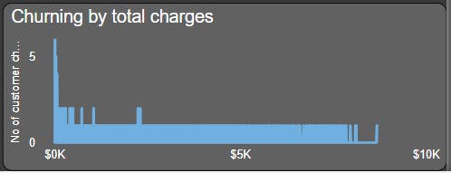
Customers is more likely to churn when the total charge is lower.
Create a line chart by putting total charges on the axis and no of customers churned on the values bar.
Create a report using this visualization. Try to experiment more using power Bi, you will be able to analyze more things from the given data.